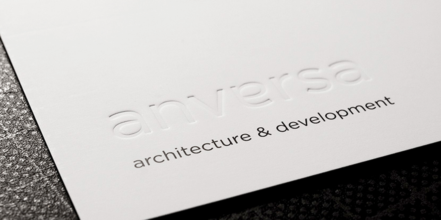
anversa architects
Anversa Architects wanted a clear/clean looking logotype. Inspired by Bauhaus icon Herbert Bayer's approach to typography during his years as head of the 'Druck ind Reklame' workshops. Skipping all capital letters and keeping everything lowercase. Everything was set in Gotham. Photography and texts were all kept black & white. © design agency Flink